What did we do?
To start this challenge, we started with the research phase by meeting with the SAVIA team. Their information, together with user comments, analytic data, and heat maps of the website, which was already in operation, allowed us to design user experience archetypes and maps, identifying the most frustrating points for Senior users in their journey through the web.
From these meetings, we identified some points for improvement:
- Senior users didn't know how to get to the content that was valuable to them.
- They did not fill in their profile, so the Organizations could not select candidates for their offers.
- All the work carried out by SAVIA went unnoticed. They created many resources, but for Senior users, they were not visible
Ideation and Design
With the information collected in the research phase and with the problems that we had to solve having been identified, we began with the Ideation phase.
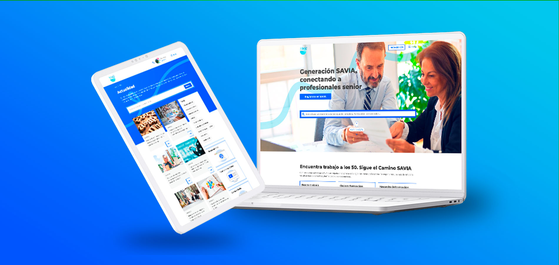
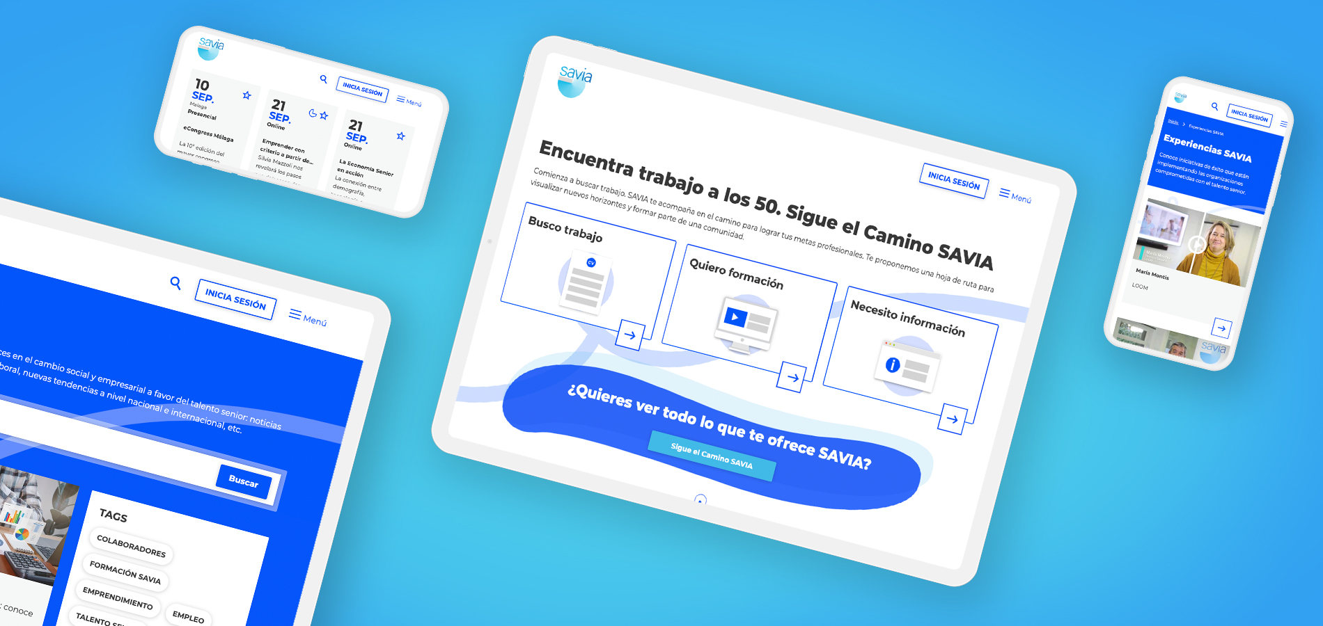
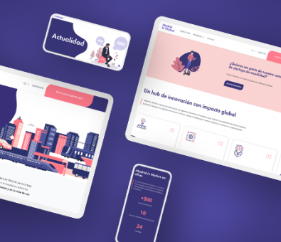
We designed some Wireframes with which we could interact and see if what was proposed would work. With these Wireframes already validated, we began the design or prototyping phase. We knew that we had to show a cleaner website and that it had to express the transformation and growth of the Senior when it passes through Generación SAVIA.
To fix the identified issues:
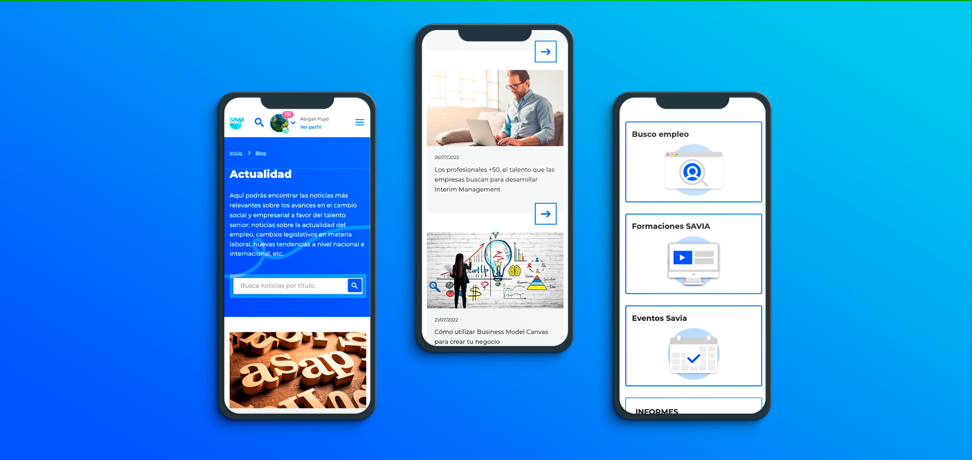
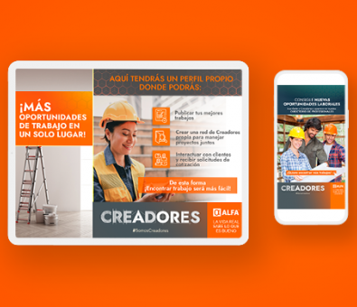
- We created a general search engine for all the resources of Generación SAVIA
- We divided the main page into sections that occupy the entire screen in order to create SAVIA information blocks, thus being much more readable and affordable for users.
- We made the SAVIA Path more intuitive, showing how each stage of the path can help the user.
- We created a section called New to SAVIA for all the resources and actions made by the SAVIA team.
- We changed the way to fill out the user's profile by turning it into a CV and adding reminder messages, explaining that if they filled it out, they would appear in the organization's searches along with a progress bar indicating the % completion of their CV.
Implementation and Development
SAVIA already had a base platform that had been evolving for years. In some aspects, it was highly positive, but in others, there may have been technical debts and features that no longer have as much traction.
Our first steps were to eliminate possible technical debt, refactor part of this code, and remove some features.
As previously mentioned, the main tasks have been carried out on the user profile. We adjusted and added new fields to request. We also created a data migration process of existing users to the new profile, as well as a recalculation of percentages. On the other hand, to respond to unique designs and mobile navigation requirements, we updated the Bootstrap and CSS libraries, allowing us to create a mobile-friendly web application.
Performance improvements were made in various listings, improvements in downloading information, and in the backend of the application to help content managers.
The Results
Listen to the user, to the team that works with them every day. This is key to identifying the problems they are facing. The data, in this case, has also been fundamental, being able to observe the behavior of users on the web.
That is why at LINK, we are committed to an agile methodology, focusing on the user and holding sessions with a team that is not only internal but is also made up of different profiles, further enriching the project that is being developed.
We were able to get a platform with a new image that represents the growth of the SENIOR user by passing through “Generación SAVIA”. Finally, we gathered resources and help so that SENIOR people can re-enter the labor market or get updated.